

ASICS Runkeeper
The New Look & Feel
ASICS Runkeeper underwent a significant transformation to enhance its brand and align its voice with its parent company, ASICS. This rebranding initiative signifies an exciting new chapter for the app, as it evolves to better support users on their fitness journey.
My Role
Collaborated on the brand & art direction
Led the implementation of the rebrand across the app’s platforms
Year Launched
2023
THe Problem
ASICS acquired Runkeeper in 2016 but there was a good portion of users who weren't aware of the connection between both brands. Some may have had a vague idea, but the association was not strong. This lack of awareness is partly attributed to the stark visual differences between ASICS and Runkeeper, with Runkeeper’s voice and messaging being disconnected from the Sound Mind, Sound Body ethos of ASICS. Moreover, the Runkeeper app was in need of a facelift to match ASICS’ latest rebrand.
The GOal

Brand Harmony
The goal of this rebrand was to better align with the ASICS visual identity and company mission in order to create a more congruent experience between both brands.
Keeping the Runkeeper spirit
The challenge was to do this in a way that didn’t alienate Runkeeper users, or lose what made Runkeeper the brand it’s become today.
improve Usability & accessibility
Increase the app’s accessibility through compliant colors and font usage; creating high contrast designs that focus on primary actions.
Our Approach
Looking at the two brands
ASICS and Runkeeper have different brand voices that resonate with their intended audience. ASICS is recognized for its reliable and innovative athletic shoes, appealing to both experienced athletes and fitness enthusiasts. On the other hand, Runkeeper takes an inclusive and motivational approach when connecting with users on their fitness journey. Both brands engage and motivate individuals in their own unique ways.
Visual Competitor Analysis
So, what’s changing?
Basically everything. 😂

The New Brand & Voice
We collaborated with Bruce Mau Design and several key partners from ASICS to develop this vision.


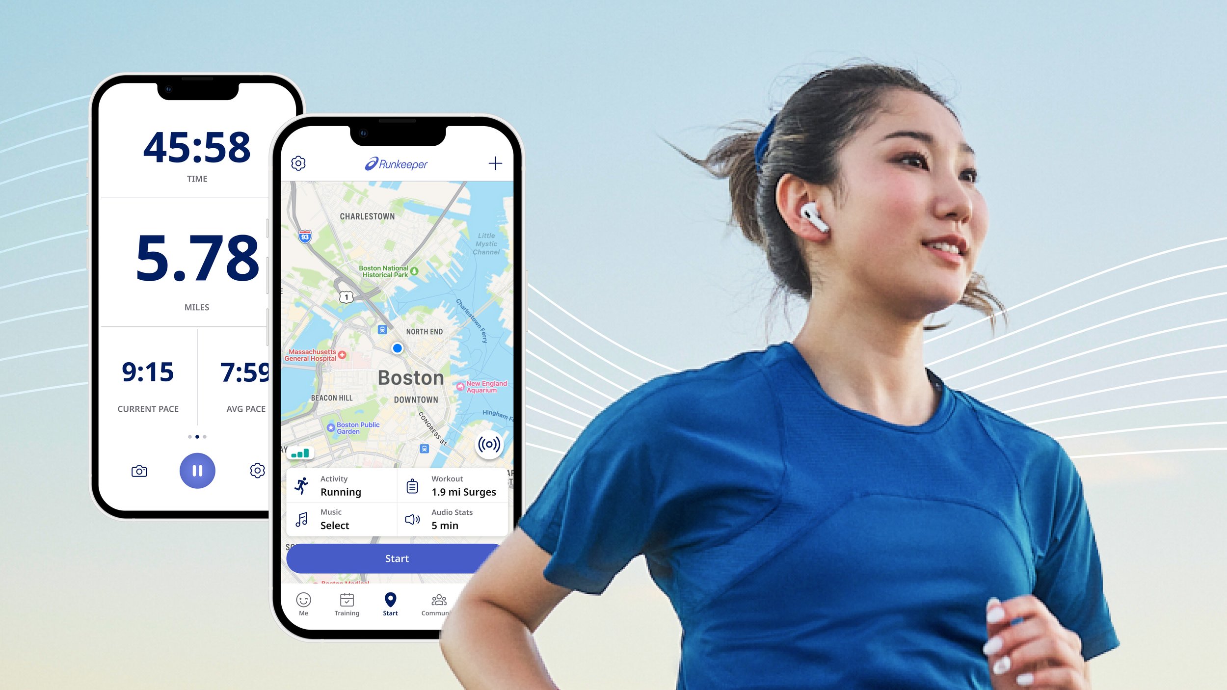
rebranding the app
After receiving the brand guidelines, we started figuring out how to incorporate these changes into the product. Due to tech debt and time constraints, we opted to maintain the app's overall information architecture and only made adjustments to the colors, fonts, icons, photography, and illustrations. This ensured that our users could continue their usual experience without any disruption.
accessibility is key
Kicking off our design process, we conducted an accessibility test with the new colors. Not all colors passed the test though.

After more testing, we also found that the proposed font, ASICS Font 3.0, presented challenges when we integrated it into the mobile app. One problem was its narrow condensed style, which made it difficult to read and created a less-than-ideal user experience.
We also needed a font that could handle different languages, including those supported by Runkeeper. However, the ASICS Font 3.0 did not meet this requirement. So, we realized we had to look for other font alternatives that would be easier to read and support a wider range of languages to better serve our global user base.
refining the color palette
After doing some research, exploring various options, and conducting color signal tests with users, we came to the decision of re-adjusting the palette hierarchy and incorporating additional secondary colors. This strategic move was made with the purpose of enhancing accessibility.

Finding a new fonT
(for in-app usage)
We selected Noto Sans as the typeface for the mobile app due to its legibility, character spacing, compatibility with ASICS Font 3.0, and extensive language support. It ensures easy reading and enhances the design's visual appeal. This choice prioritizes user experience, brand consistency, and accessibility for a global audience.


Redesigning the Icons
The Product Design team adjusted the icon style given by Bruce Mau Design to enhance accessibility and better match ASICS' iconography.
Visuals that make you want to “RUN”!
Thanks to James O’Connell for creating these badges and illustrations, which gives our users a fresh feeling of accomplishment.
Runkeeper Before…

and After ✨


The Reactions

90.32% users said they felt the same or better about Runkeeper post-rebrand
Change is not easy to accept, especially when you've been using an app for so many years. However, after carefully analyzing the data and observing the overall sentiments expressed on various social media platforms, we were pleasantly surprised to see that the majority of users were actually quite excited about the update and the fresh look it brought to the table.
"Look at Runkeeper changing its font and color scheme after 12 years!"
“I liked it. Looks more sleek and cohesive than the previous design”
“I’m pretty competitive, and the rebrand has made it easier to compare the workouts, and track my progress.”
“Looks more colourful and modern. [I] noticed when it happened and I said ‘Oh, okay, this is new!’”
Reflections
Team Work Makes the Dream Work 👏
Making this rebrand work would not have been possible without everyone involved. Seriously. Every single person who had a hand in this deserves a gold star medal and standing ovation.
Stepping Up 💪
This project was truly a memorable experience for me. Our teams faced numerous challenges, including technical constraints, tight deadlines, and the need to balance everyone's input and feedback. However, the challenges gave me valuable lessons on how to lead multiple initiatives while maintaining effective communication.
Design SystemS Rule 🤘
Going into this rebrand, our team knew we needed a way to get around all the tech and design debt the app had accumulated over the years (without blowing scope out of the water). That’s how the Runkeeper Design System was born and it’s been a lifesaver for design and development ever since.